Women's Equality Day Remix
An online conversation this week about a Time Magazine infographic caught my attention. It started on Stephen Few's blog and continued on Alberto Cairo's.
They both make excellent points. Many will defend the use of otherwise extraneous illustrative elements in a data graphic as a means of catching attention and aiding retention. I agree that those are two admirable goals and need consideration, provided that the primary goal is still to facilitate insight. The discussion, including the observations from others, made me want to create a cleaned up version of my own. So here it is:
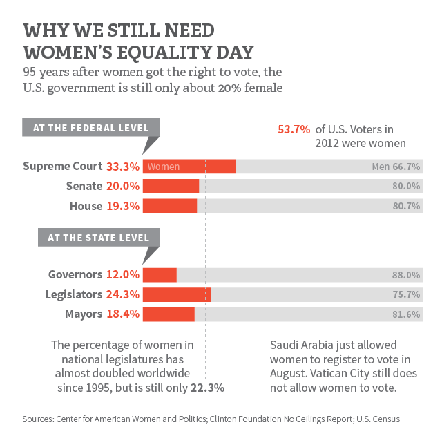
Redesigning the work of others is a useful exercise - it makes you think about the data more deeply, it provides a different perspective, and it's good for refining your own skills. That said, I am hesitant to condemn the work of others without knowing the conditions under which it was produced. I am keenly aware that deadlines, higher-ups, and other factors can divert a project from the designer's intent.
Thanks to Stephen and Alberto for encouraging discussion, and to Time Magazine for providing the fodder for it.